 How do you parse large chunks of data looking for sharable insights?
Martha Kang, editorial manager of Tableau Software (a maker of visualization software), writing in Mediashift, says that you should try to display information so the user can explore the data in at least one of these seven ways:
The Seven Basic Types of Data Stories
- Narrate change over time (how has x changed over the last decade?)
- Start big and drill down (how much x is there in the world? How much in my zipcode?)
- Start small and zoom out (there is this much x in your zipcode. See how much there is in the world)
- Highlight contrasts (see how far apart the highs and lows of x are)
- Explore the intersection of trends (what does it mean when x grows to be greater than y?)
- Dissect the factors (see the how much of x‘s growth is caused by y and z)
- Profile the outliers (see how x is not at all like z)
Here are a couple of great examples:
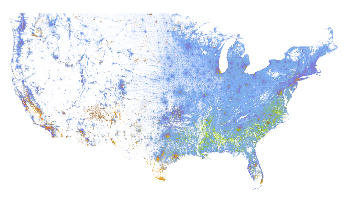
- The Racial Dot Map (One dot per person for the entire United States) by Dustin Cable
- Propublica’s Surgeon Scorecard (complication rates for surgeons performing eight procedures in Medicare)
via Mediashift